 Vipin PG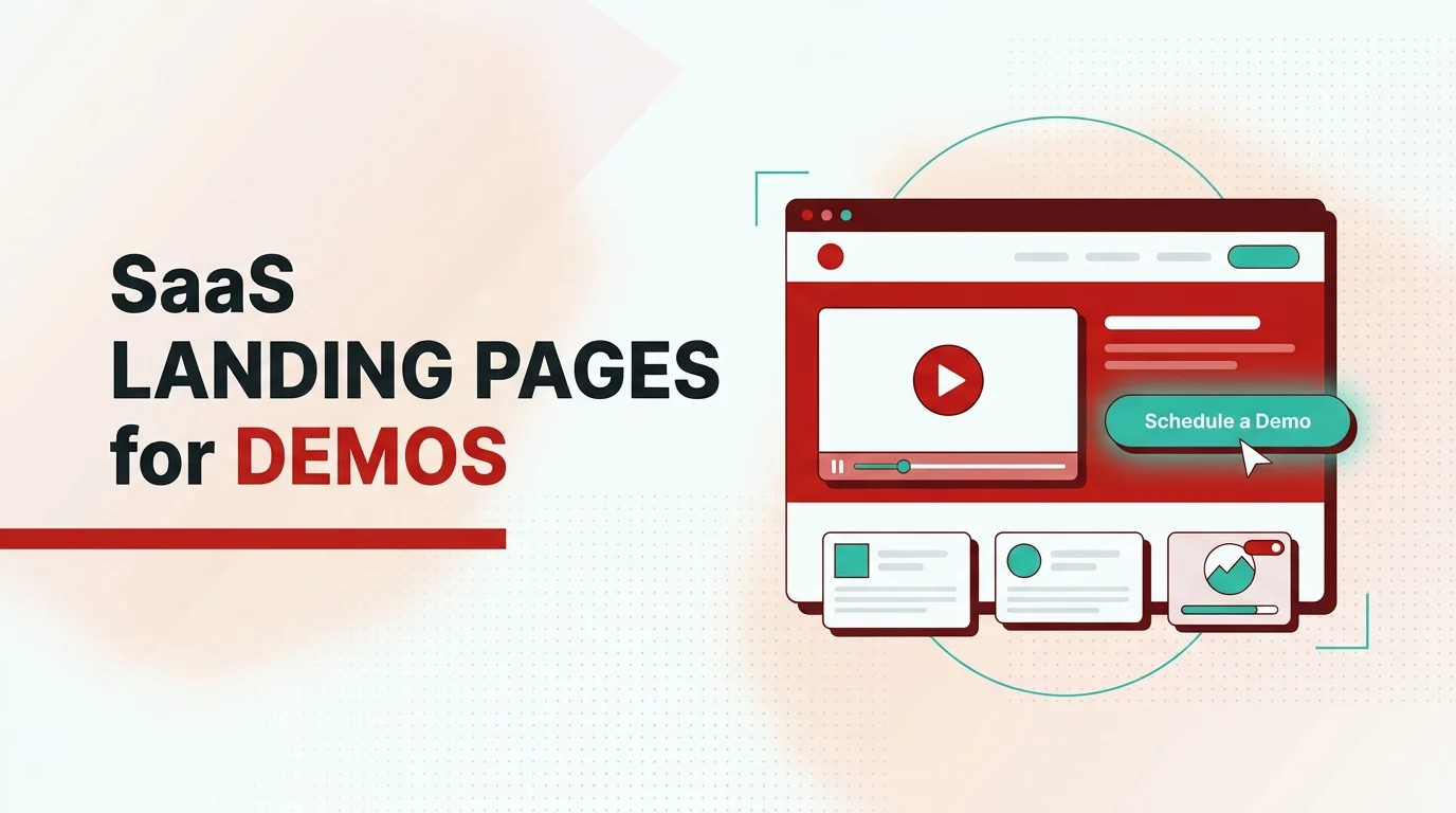
On every demo call for a grant management platform we worked with, the same sentence came up. I am not sure I understand what you actually do.
The traffic was fine and the form worked. But SaaS landing page design for demos fails the moment a qualified buyer cannot tell, in five seconds, whether the product is for them.
The page was explaining the software. It should have been earning the demo.
Your Page Is Answering the Wrong Question
Most teams read a low demo count as a form problem or a button problem. They shorten the form, change the CTA color, add a second call to action, and run more ads. The number rarely moves, because the leak is upstream.
The visitor is not hesitating at the form. They are hesitating at the top of the page, because they still cannot answer the only question that matters to them. Is this for me, and what is it.
A demo request is a high-trust action, and no one takes it while still confused about what you sell.
We see this across funded SaaS and AI startups. The page opens with a clever tagline, an autoplay hero video, or a carousel trying to speak to four personas at once. The buyer does the sorting work the page should have done for them.
By the time they reach the demo ask, they have already decided they are unsure. Unsure people do not book demos. Add broad-keyword ads pointing at a page built for insiders, and the traffic looks healthy while the intent never matches, so the page gets blamed for a targeting problem it did not create.
The real work of a demo page is not persuasion. It is removing every reason a qualified buyer hesitates before raising their hand.
A Demo Page Is a Qualifier, Not a Net
Most teams design a demo page like a net. Cast it wide, catch everything, sort later. That thinking produces long forms, vague CTAs, and pages built to chase volume.
It fills the pipeline with people who were never going to buy and buries the ones who would. A better model treats the page as a qualifier. Its job is to help the wrong-fit visitor leave without friction and give the right-fit visitor enough confidence to commit.
Fewer raw leads, more qualified demo requests, a happier sales team. This is why the fix is rarely on the demo page itself. It usually sits upstream, in whether the page communicates who the product serves and what outcome it delivers.
When a Program Director can tell in seconds that the product is built for their kind of organization, the demo request becomes the natural next step instead of a leap. Selling the demo, not the product, is the whole shift.
You are not trying to close the sale on the page. You are trying to make one specific person, the one who fits, want a closer look. Everything else on the page either moves that person toward raising their hand or it is noise.
What We Learned Rebuilding a Grant Platform's Demo Path
A grant management platform we worked with had a demo request page that was doing almost nothing. Four different roles were landing on it. A Program Manager, a Program Director, an Executive Director, and a Finance Manager.
Each arrived with the same private question. Is this software actually for an organization like mine. The page could not answer it.
The homepage led with what the product did in the abstract, without naming who it served or why it was different. The demo page itself was a single long form with a stack of fields, no testimonials, and no credibility markers to reassure a cautious buyer.
In every demo call the team ran, the same feedback surfaced. People could not tell what the product was.
The obvious fix was the form. Shorten it, tidy it, add a nicer button.
We threw that out, because the form was not the leak. The leak was that people reached the form still unsure whether the product was for them.
So we started upstream. We rebuilt the homepage to say plainly what the product is, who it serves, and what makes it different. We restructured the navigation so buyers could self-qualify, with a path by use case and a path by persona, so a Finance Manager and a Program Director could each find their own reason to keep going.
Then we rebuilt the demo page around confidence. We added testimonials, an element that answered the questions people actually had, and a shorter form. We replaced the generic Contact Us with a focused Book a demo.
Requests improved, and the quality of them improved more. The people filling the form now understood what they were asking for.
The lesson is simple. Fix clarity before you touch the form, because a demo page can only convert the confidence the rest of the page created.
SaaS Landing Page Design for Demos: Seven Rules We Stand By
1. Make "is this for me" answerable in five seconds
Before a single word about features, the page has to tell a visitor what the product is and who it serves. Most demo leaks are really recognition leaks, where the buyer could not place themselves in the story fast enough.
Name the audience and the outcome above the fold, and let the right person recognize themselves before you ask them for anything.
2. Sell the business outcome, not the feature list
Self-serve pages can lead with features because the user will try the thing themselves. A demo page cannot.
The person requesting a demo is buying a result, not a tour of the interface. Lead with the outcome the product delivers for their role, and let features earn their place as proof of that outcome, never as the headline.
3. Give the page one job and no side doors
Every extra link is an exit. A demo page crowded with navigation, secondary offers, and learn-more paths invites the visitor to wander off before they act.
Strip the alternate routes, so the page offers one meaningful action, booking the demo, and every other element serves that single decision. A focused page is not a smaller page, it is a page that respects why the visitor came.
4. Cut the hero theater
Autoplay videos, four-slide carousels, and animated cleverness feel like effort. To a cautious buyer they read as work.
A carousel that pitches four messages commits to none, and a long hero video assumes attention you have not earned yet. Replace the theater with one clear statement of what the product does and who it is for.
5. Design the form as the last small step, not the wall
Every field you add is a reason to leave. Ask only for what sales genuinely needs to run a useful first call, and let the rest come later.
Use inline validation so no one is punished after the fact for a typo. The form should feel like the easy final step of a decision already made, not a fresh interrogation.
6. Put proof right next to the ask
Confidence is at its highest or lowest at the exact moment someone decides to fill the form. That is where proof belongs.
Place testimonials, recognizable logos, and clear answers to common objections beside the demo request, not buried three sections up. Credibility works best where hesitation lives, so the buyer sees a reason to trust you in the same glance as the button.
7. Match the CTA to the intent you want
Contact Us is a generic ask that signals nothing about what happens next. Book a demo tells the visitor exactly what they are agreeing to and what they will get.
An outcome-driven CTA sets the right expectation and filters for the right intent. The words on the button are a promise, so make the promise specific.
Where to Start This Week
Open your demo page and read the top of it as one of your actual buyers, someone in the role you most want on a call. Ask one question.
Can I tell what this is and whether it is for me in five seconds. If the honest answer is no, that is your leak, and no form tweak will fix it.
Then take an inventory. List everything on the page that signals who you serve, the outcome you deliver, and why you can be trusted, and count how much of it sits next to the demo request. For most pages the space around the button is the emptiest part of the page, which is exactly backwards.
Bottom line, good SaaS landing page design for demos is not about persuading strangers. It is about helping the right person recognize themselves, feel confident, and take one clear action. Sell the demo, not the product, and design every element to move that one person toward raising their hand.
If your page is explaining your product when it should be earning demos, that is the work our SaaS product design team does every day. Start there, before you run another round of traffic at a page that cannot yet close the gap.